
In the process of moving things over to our own hosted blog at Infojocks.com/blog. Hopefully it's a bit of an upgrade over blogspot. Be sure to check it out for new content.
September 29, 2009
September 11, 2009

August 19, 2009
Graphic: Starting quarterbacks in NFC North.
Brett Favre's signing with the Minnesota Vikings officially tarnished the relationship between number four and the Green Bay Packers fanbase that saw him start 253 consecutive games under center. During that time, the Packers' divisional foes—the Vikings, Lions, and Bears—started 48 different quarterbacks. With those three teams again expecting new starting quarterbacks (Cutler with the Bears, Stafford with the Lions, and Favre with the Vikings), Favre suddenly finds himself on the other side of that statistic.
(click to enlarge)

(click to enlarge)

August 18, 2009
Graphic: Perfect games. Part two.
So just how rare and incredible an accomplishment is a perfect game? Since 1969, 12 men have been privileged enough to walk on the lunar surface, representative of the greatest achievement in the history of man. In the same time span, only 9 men have pitched perfect games. Mark Buerhle joined an incredibly selective club with his perfect gem on July 23.


August 13, 2009
Graphic: Perfect games. Part one.
Of course, I'm a little late on this, seeing as how it's been a month since Mark Buehrle threw his outstanding perfect game (incredibly followed up by another six perfect innings in his next start). However, perfect games are so rare, I couldn't help but take an opportunity to do a bit of research on the feat. More isotype graphics to follow about how rare Buehrle's game is.
Interesting to note that the first reference of a perfect game came in 1908 from I. E. Sanborn in the Chicago Tribune. Concerning Cleveland pitcher Addie Joss's perfection against the White Sox, Sanborn described "an absolutely perfect game, without run, without hit, and without letting an opponent reach first base by hook or crook, on hit, walk, or error, in nine innings."
In addition, being from Pittsburgh, I've long been aware of the incredible 12 perfect innings pitched in a loss by Harvey Haddix. The Pittsburgh Post-Gazette has a great write up about the game known as a "perfect loss." For a listing of more perfect and near-perfect games, check out the graphic below.

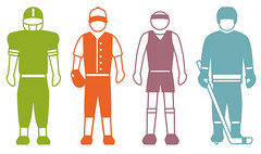
Sports isotype.
Isotype, basically a specific language of pictograms, was developed by Otto Neurath in the 1920s. Initially intended for use in the education of children, isotype has since seen many applications in the field of infographics. I first became aware of the immense potential for isotype after seeing this incredible graphic by the New York Times. After a bit of thinking, I came to the realization that the marriage of sports statistics and isotype is a wonderful opportunity for some informative graphics.
So the first step was the creation of my little sports figures. I don't have a very strong background in icon or symbol design, so this process had its difficulties. But here are the results:
I've also thrown together a couple small graphics that show the potential application of these graphics, so I'll post those soon. In the meantime, here are few more isotype resources I found particularly inspiring. First, a neat post with lots of retro maps and isotype. Second, an article about Neurath's artist and partner, Gerd Arntz. Third, and a little unrelated but equally inspiring and in the spirit of isotype, a collection of all the Olympic pictograms used since their introduction in 1964. And as an added bonus, here are the new pictograms for the Vancouver 2010 winter games.
July 9, 2009
Spotlight: Tour De France infographics.
So sorry for the long delay between posts. The last few weeks have been filled with emptying, cleaning, organizing, and wiring Infojock's new office. I will post some photos of the new digs tomorrow. But for now, I've thrown together some Tour De France graphics. Admittedly, there are only five of, and two are outdated (with big headlines about Lance's final tour... three years ago). However, it's good to have them all together so I can add to them as more undoubtedly come out. The Tour De France offers a wonderful opportunity for infographic work because so many Americans know so little about the sport. Peletons? Stages? Check out the graphics below and learn a few things about this grueling event.
First off, we have two newspaper double-trucks from Lance's farewell tour victory. Wonderfully executed by The Oregonian and The St. Pete Times. Great insights into tour strategy, the geography of the course, and the anatomy of a cyclist.


Next, we have three graphics that track the process of the Tour. First is the AP graphic from 2008. Next is a very impressive interactive by the Wall Street Journal. And last is a great graphic by Periscopic that follows Chipotle's 2009 team as they try to take the yellow jersey.


Hopefully we can keep the blog posts coming with a bit of regularity now. Let us know if you find any more Tour graphics, and we'll be sure to post them.
First off, we have two newspaper double-trucks from Lance's farewell tour victory. Wonderfully executed by The Oregonian and The St. Pete Times. Great insights into tour strategy, the geography of the course, and the anatomy of a cyclist.
Next, we have three graphics that track the process of the Tour. First is the AP graphic from 2008. Next is a very impressive interactive by the Wall Street Journal. And last is a great graphic by Periscopic that follows Chipotle's 2009 team as they try to take the yellow jersey.
Hopefully we can keep the blog posts coming with a bit of regularity now. Let us know if you find any more Tour graphics, and we'll be sure to post them.
Subscribe to:
Posts (Atom)

